Useful Resources
Accordeon
The accordeon can be used to give extra information about a subject. It takes up the whole width of a column with a maximum of 960px. The first subject is always open until closed by the user.
If you are adding a F.A.Q. please use the FAQ block for it provides the option to add an ID (hashtag) where you can link to. This is useful for guiding visitors directly to the right section on a page if necessary.
-
Lorem ipsum odor amet, consectetuer adipiscing elit.
-
Lorem ipsum odor amet, consectetuer adipiscing elit. Orci sociosqu urna nostra consectetur nisl; donec maecenas magnis. Est convallis maximus vel parturient porttitor sit. Torquent dignissim est mi suscipit elementum tempus pulvinar pulvinar bibendum. Habitant netus maecenas interdum, in inceptos dolor class. Pellentesque curabitur nec dolor porttitor nibh imperdiet. Habitant leo ut blandit viverra volutpat feugiat. Cras euismod efficitur; fames ultrices non pretium fringilla volutpat.
-
Egestas ridiculus vel nisl purus metus ligula ultricies eget.
-
Metus et leo litora finibus cubilia condimentum tortor amet. Laoreet auctor scelerisque arcu ut neque. Convallis fringilla leo ornare dapibus porta lobortis enim. Eros elementum mi quis ipsum; habitasse congue sed vel. Pharetra ipsum amet dapibus senectus metus ad turpis. Duis condimentum in dignissim sit placerat. Porttitor habitasse mollis pharetra eleifend arcu nec aptent lacinia. Ullamcorper elementum magnis vulputate vitae cras integer ultrices porta.
Dignissim integer morbi diam finibus
Lorem ipsum odor amet, consectetuer adipiscing elit. Diam lacus duis mattis conubia pretium integer phasellus. Dictum torquent donec integer eleifend sem nullam molestie.
Diam lacus duis
-
Praesent senectus at cras, sapien libero mattis.
-
Lorem ipsum odor amet, consectetuer adipiscing elit. Sem aenean dolor nisi nascetur euismod odio lectus vestibulum. Ex gravida sit maximus diam purus. Ex vehicula varius primis curabitur eu commodo vel. Phasellus sed nisi facilisi egestas praesent tempor. Praesent senectus at cras, sapien libero mattis.
Accordeon Mobile View
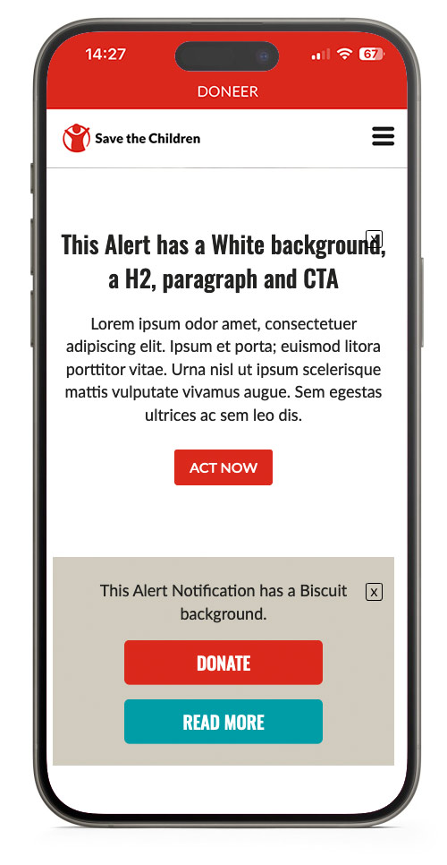
Alert Notification
An Alert Notification is used to warn visitors about something, they can remove the message from the page by clicking the cross. Once it is clicked away it will not be visible again for 24 hours, unless the user removes cookies from their browser.
You can set a date from when the message will be no longer visible on the page. This can be useful for warning about website maintanance or if a (sponsor) campaign is about to expire.
- One or more CTA's can be added if necessary
- Headings are optional and should be placed in the text editor
- Text will be centered at all times
- The alert will be 100% width of the column it is in
This Alert has a White background, a H2, paragraph and CTA
Lorem ipsum odor amet, consectetuer adipiscing elit. Ipsum et porta; euismod litora porttitor vitae. Urna nisl ut ipsum scelerisque mattis vulputate vivamus augue. Sem egestas ultrices ac sem leo dis.
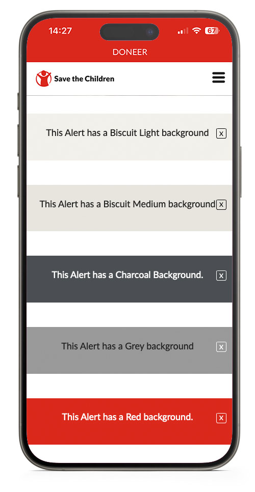
This Alert has a Biscuit Light background
This Alert has a Biscuit Medium background
This Alert has a Charcoal Background.
This Alert has a Grey background
This Alert has a Red background.
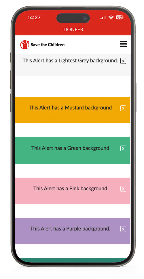
This Alert has a Lightest Grey background.
This Alert has a Mustard background
This Alert has a Green background
This Alert has a Pink background
This Alert has a Purple background.
This Alert has a Teal Gradient background
Alert Mobile View
Card Plus
A block with many options, mainly used to highlight related articles or display features.
Due to the many options in the card Plus Block, it is hard to keep track of all data in it block when editing, use the collapse all button to keep track of all cards.
When you have made one card use the three dots at the right top of the card to duplicate the card and keep all settings of the card the same.
- There is an option to add a link at the bottom of the cards to direct visitors to a landing page.
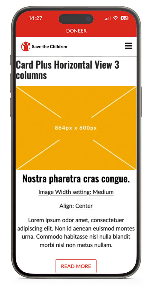
- Images will not be cropped to a pre-defined aspect ratio, but displayed as uploaded.
- Horizontal view has a minimum of 3 columns and a maximum of 4 columns until the row breaks to the next line.
Card Plus Horizontal View 3 columns

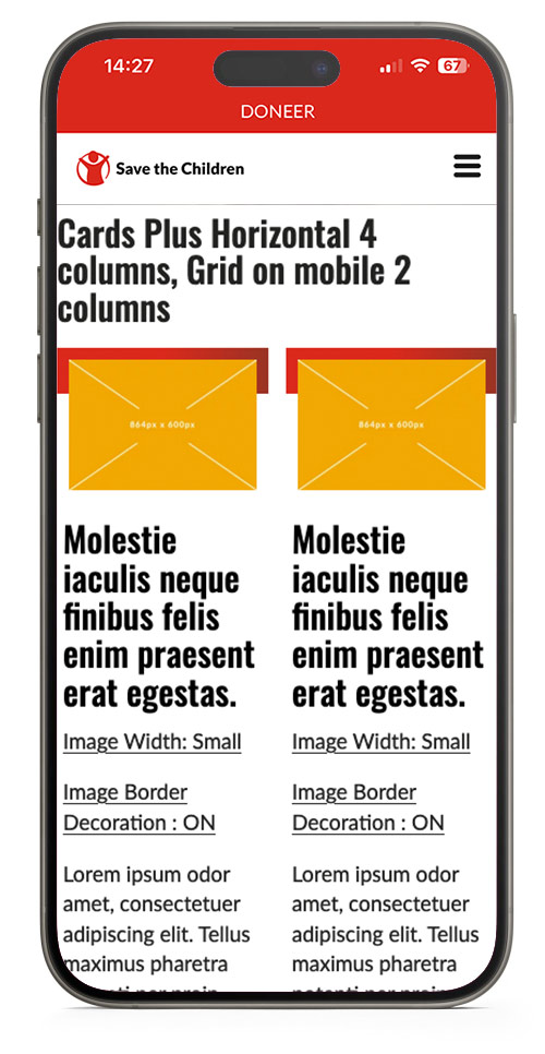
Cards Plus Horizontal 4 columns, Grid on mobile 2 columns

This is a caption of a medium image file.
Molestie iaculis neque finibus felis enim praesent erat egestas.
This is a caption of a medium image file.
Molestie iaculis neque finibus felis enim praesent erat egestas.
This is a caption of a medium image file.
Molestie iaculis neque finibus felis enim praesent erat egestas.
This is a caption of a medium image file.
Molestie iaculis neque finibus felis enim praesent erat egestas.
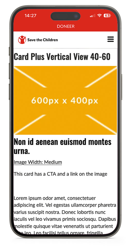
Card Plus Vertical View 40-60
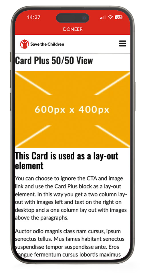
Card Plus 50/50 View

This is a caption of a medium image file.
Image Sizes
The Card Images have the possibility for a image size setting. If the image is displayed too small, it will be blurry. If the image is too big, it will take longer to load and will cost the user more MB's from a possible databundle. The images are not cropped to a aspect-ratio but are displayed as uploaded with a maximum width.
Bug sept 2024: Image Width setting per image is broken, the with setting of the first card is used for all card images on the page. Even if they are in another block.
| Image Width Setting | |
| Card Plus Horizontal view - 3 columns | Small |
| Card Plus Horizontal view - 4 columns | Small |
| Card Plus Vertical View 40-60 | Medium |
| Card Plus 50/50 View | Medium |
Card Plus Mobile View
Note the vertical mode does not have padding on mobile (bug sept. 2024)
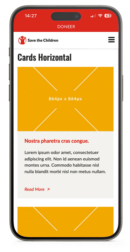
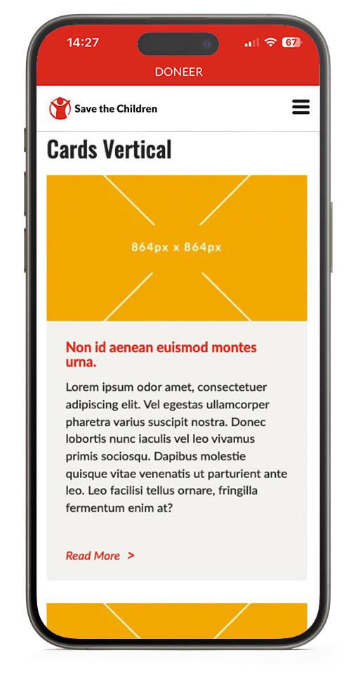
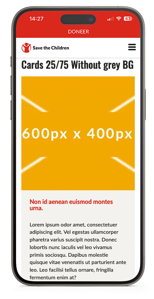
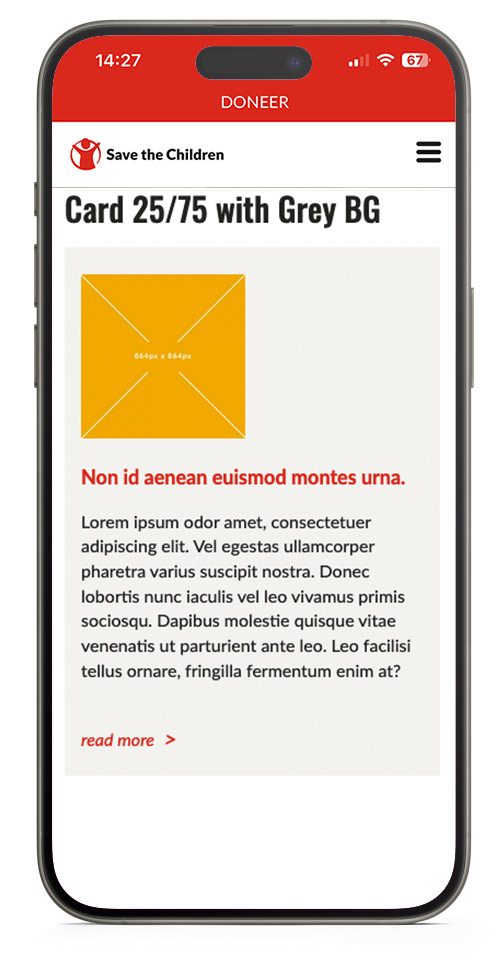
Cards
Cards always have a biscuit background and is available in a variation of lay-outs. Note that the images are cropped to landscape format in vertical and horizontal view. And cropped to a square on 40/60 and 25/75 view.

Nostra pharetra cras congue.
Lorem ipsum odor amet, consectetuer adipiscing elit. Non id aenean euismod montes urna. Commodo habitasse nisl nulla blandit morbi nisl non metus nullam.
Nostra pharetra cras congue.
Lorem ipsum odor amet, consectetuer adipiscing elit. Non id aenean euismod montes urna. Commodo habitasse nisl nulla blandit morbi nisl non metus nullam.
Non id aenean euismod montes urna.
Lorem ipsum odor amet, consectetuer adipiscing elit. Vel egestas ullamcorper pharetra varius suscipit nostra. Donec lobortis nunc iaculis vel leo vivamus primis sociosqu. Dapibus molestie quisque vitae venenatis ut parturient ante leo. Leo facilisi tellus ornare, fringilla fermentum enim at?
Image Sizes
Images will be shown in a fixed aspect ratio and uploaded images will be cropped to fit. Upload images in the right size to maintain contol on how it looks.
| Desktop & Mobile | |
| Cards Horizontal | 624px x 416px |
| Cards Vertical | 395px x 222px |
| Cards 25/75 Without Grey Background | 280px x 280px |
| Cards 25/75 Without Grey Background | 280px x 280px |
Cards Mobile View
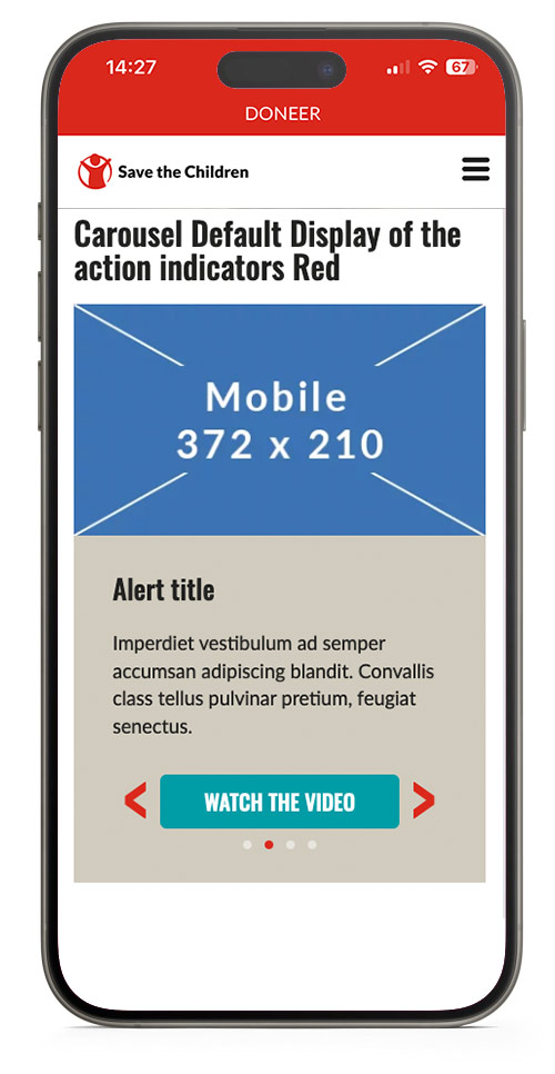
Carousel
Show a carousel with multiple slides.
Use this element with care and do not add too much text in the slide because it will push the carousel navigation below the fold of the screen on mobile and people will not notice this is a carousel.
To use this element at it's best, try to:
- Keep all images the same size.
- Keep all text the same lenght.
- Keep text as short as possible.
Carousel Default Display of the action indicators Red

This is the image caption field in the carousel.
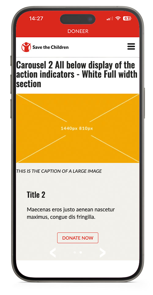
Carousel 2 All below display of the action indicators - White Full width section

Image Sizes
Images will be shown at 50% of the available width, with a max width of 480px in a default section and 960px in a full width section.
| Desktop max width | Mobile max width | |
| Carousel default section | 480px | 375px |
| Carousel full width section | 960px | 375px |
Carousel Mobile View
CTA
Call to Action or button.
Stands out on a page, is easy recognisable as something you can click on.
Try to use a CTA that reveals what is going to happen after the click, like continue reading, sign up, donate now, volunteer, join us.
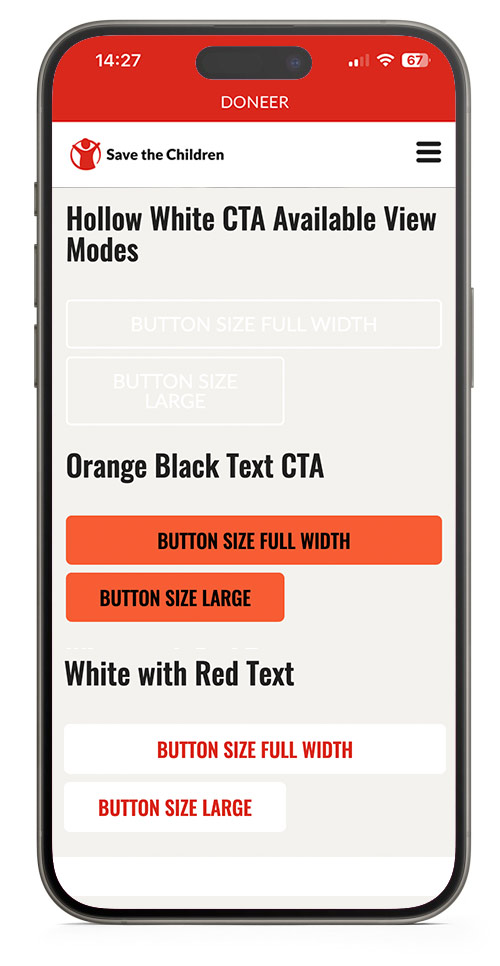
Lots of styling options are possible, for consistency use default CTA's: Primary, Secondary or Tertiary and only use other variations when you have a good reason to do so.
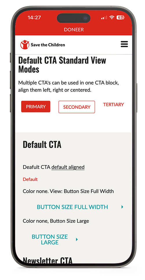
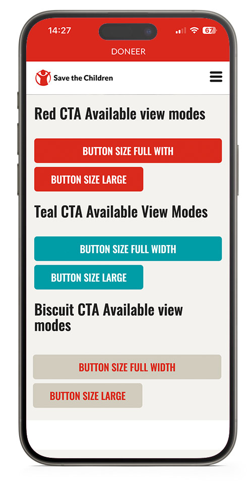
Default CTA Standard View Modes
Multiple CTA's can be used in one CTA block, align them left, right or centered.
Default CTA
Deafult CTA default aligned
Color none. View: Button Size Full Width
Color none, Button Size Large
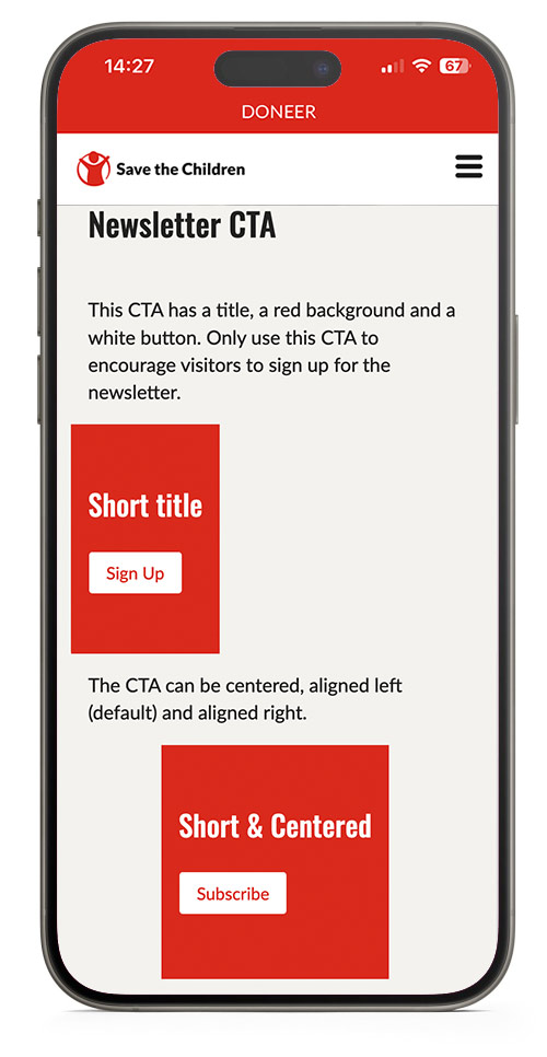
Newsletter CTA
This CTA has a title, a red background and a white button. Only use this CTA to encourage visitors to sign up for the newsletter.
The CTA can be centered, aligned left (default) and aligned right.
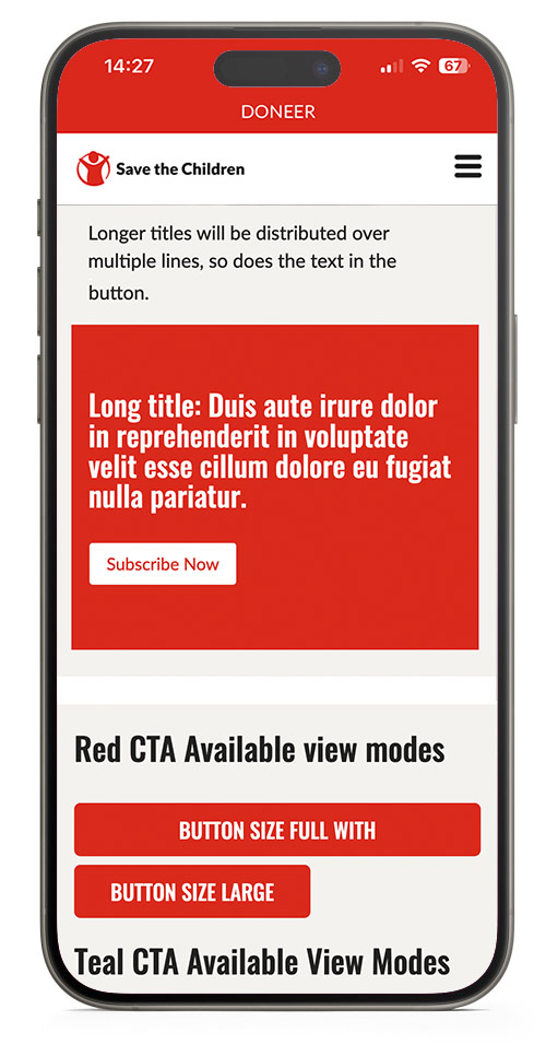
Longer titles will be distributed over multiple lines, so does the text in the button.
CTA Mobile View
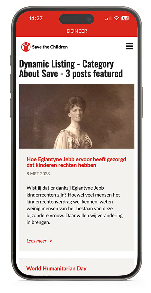
Dynamic Listing
Automatically display 9 post cards filtered by Country, Category AND/OR Topic.
Pick specific posts to show at the top of the list by using the featured content option.
Dynamic Listing - Category About Save - 3 posts featured

8 Mar 2023
global
Hoe Eglantyne Jebb ervoor heeft gezorgd dat kinderen rechten hebben
Wist jij dat er dankzij Eglantyne Jebb kinderrechten zijn? Hoewel veel mensen het kinderrechtenverdrag wel kennen, weten weinig mensen van het bestaan van deze bijzondere vrouw. Daar willen wij verandering in brengen.

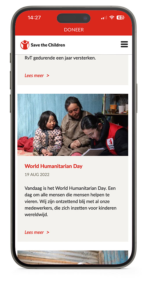
1 Feb 2023
Raad van Toezicht Save the Children Nederland verjongt flink
Per 1 februari treden twee jongvolwassenen toe tot de Raad van Toezicht van Save the Children: Aoife Fleming (25) en Manal Moussane (23). Beiden zullen de vijfkoppige RvT gedurende een jaar versterken.

19 Aug 2022
global
World Humanitarian Day
Vandaag is het World Humanitarian Day. Een dag om alle mensen die mensen helpen te vieren. Wij zijn ontzettend blij met al onze medewerkers, die zich inzetten voor kinderen wereldwijd.

28 Aug 2025
VN-toespraak: ‘Honger als oorlogswapen in Gaza’
Hieronder volgt een verklaring van Save the Children International CEO Inger Ashing aan de VN-Veiligheidsraad op woensdag 27 augustus.

18 Aug 2025
Prinses Viktória de Bourbon de Parme viert jubileum als beschermvrouwe
Dit jaar is het precies tien jaar geleden dat Hare Koninklijke Hoogheid Prinses Viktória de Bourbon de Parme zich als beschermvrouwe verbond aan Save the Children.

17 Jul 2025
global
TeamUp: Verbetering van het welzijn van kinderen in Caribisch Nederland
Kinderen op de Nederlandse Cariben groeien vaak op in stressvolle omstandigheden. Het leven is er duur en veel ouders hebben meerdere banen nodig om rond te komen. Bovendien is er jaarlijks het risico op natuurgeweld, zoals orkaan Irma die in 2017 grote schade aanrichtte op Sint-Maarten. Deze dreiging zorgt voor voortdurende stress bij de kinderen die er wonen.

14 Apr 2025
global
Save the Children leidt als eerste met zorgteams voor moeder en kind
We zijn trots om te delen dat de noodhulpdienst van Save the Children als eerste niet-gouvernementele organisatie is goedgekeurd door de Wereldgezondheidsorganisatie (WHO). Onze specialistenteams mogen nu wereldwijd worden ingezet om moeders en pasgeborenen te helpen in crisissituaties.

3 Apr 2025
Kinderen mogen niet de dupe worden van politieke keuzes
Deze week stonden we bij de Hofvijver in Den Haag. Met stapels dozen vol essentiële hulp zoals babykits, voedselpakketten en schoolspullen lieten we zien wat er op het spel staat. Want wereldwijd wordt levensreddende hulp wegbezuinigd, en de gevolgen zijn verwoestend.

24 Mar 2025
Een nalatenschap uit liefde: het verhaal van Gerard Claveaux
Gerard Claveaux groeide op in Zaltbommel, in een warm gezin met vijf broers en een zus. Hij leidde een bescheiden leven, vol dankbaarheid en tevredenheid. Hoewel zijn gezondheid hem parten speelde en hij nooit een eigen gezin stichtte, stond hij altijd klaar voor anderen, tot het einde toe.
Dynamic Listing Mobile View
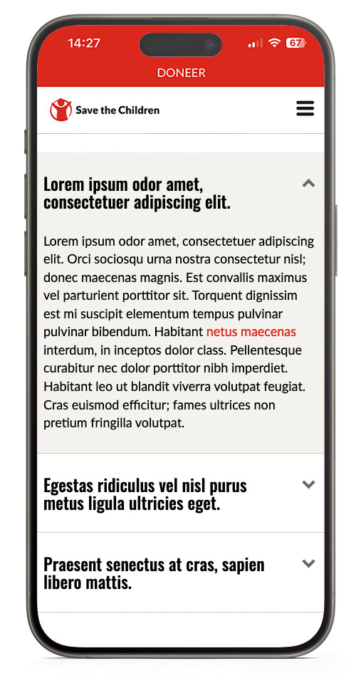
FAQ List
Make sections and lists of Frequently Asked Questions, achors will be added to be able to link to a direct question. (www.url.com/page#link-to-question)
The block will automatically adds a table of content per section.
Note that the to top link only works well when the FAQ is placed at the top of a page.
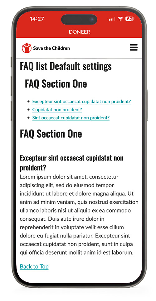
FAQ list Deafault settings
FAQ Section One
Excepteur sint occaecat cupidatat non proident?
Lorem ipsum dolor sit amet, consectetur adipiscing elit, sed do eiusmod tempor incididunt ut labore et dolore magna aliqua. Ut enim ad minim veniam, quis nostrud exercitation ullamco laboris nisi ut aliquip ex ea commodo consequat. Duis aute irure dolor in reprehenderit in voluptate velit esse cillum dolore eu fugiat nulla pariatur. Excepteur sint occaecat cupidatat non proident, sunt in culpa qui officia deserunt mollit anim id est laborum.
Cupidatat non proident?
Lorem ipsum dolor sit amet, consectetur adipiscing elit, sed do eiusmod tempor incididunt ut labore et dolore magna aliqua. Ut enim ad minim veniam, quis nostrud exercitation ullamco laboris nisi ut aliquip ex ea commodo consequat. Duis aute irure dolor in reprehenderit in voluptate velit esse cillum dolore eu fugiat nulla pariatur. Excepteur sint occaecat cupidatat non proident, sunt in culpa qui officia deserunt mollit anim id est laborum.
Sint occaecat cupidatat non proident?
Lorem ipsum dolor sit amet, consectetur adipiscing elit, sed do eiusmod tempor incididunt ut labore et dolore magna aliqua. Ut enim ad minim veniam, quis nostrud exercitation ullamco laboris nisi ut aliquip ex ea commodo consequat. Duis aute irure dolor in reprehenderit in voluptate velit esse cillum dolore eu fugiat nulla pariatur. Excepteur sint occaecat cupidatat non proident, sunt in culpa qui officia deserunt mollit anim id est laborum.
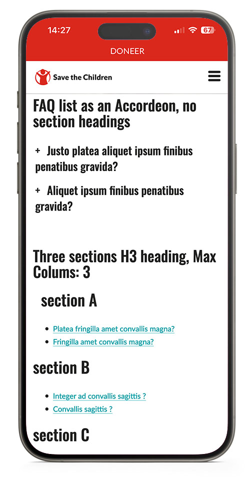
FAQ list as an Accordeon, no section headings
Justo platea aliquet ipsum finibus penatibus gravida?
Lorem ipsum odor amet, consectetuer adipiscing elit. Nec erat suscipit, hac vulputate adipiscing litora. Viverra orci enim nostra vulputate fringilla cras; consectetur efficitur. Justo platea aliquet ipsum finibus penatibus gravida. Adipiscing eleifend eros rutrum primis neque consectetur sem? Natoque finibus facilisis id congue aliquet fringilla sit. Interdum bibendum augue ad vehicula nunc sed dictum.
Aliquet ipsum finibus penatibus gravida?
Lorem ipsum odor amet, consectetuer adipiscing elit. Nec erat suscipit, hac vulputate adipiscing litora. Viverra orci enim nostra vulputate fringilla cras; consectetur efficitur. Justo platea aliquet ipsum finibus penatibus gravida. Adipiscing eleifend eros rutrum primis neque consectetur sem? Natoque finibus facilisis id congue aliquet fringilla sit. Interdum bibendum augue ad vehicula nunc sed dictum.
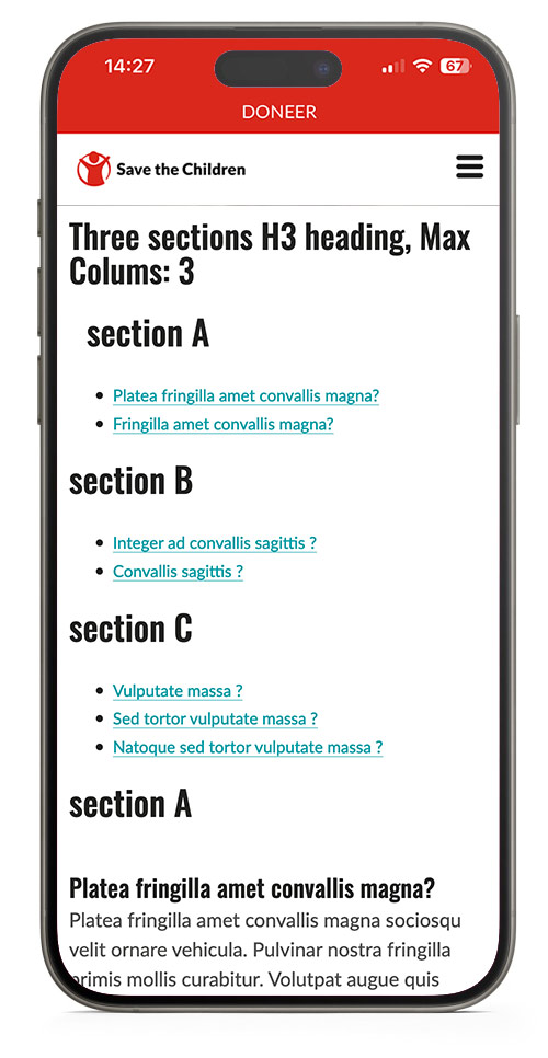
Three sections H3 heading, Max Colums: 3
section A
Platea fringilla amet convallis magna?
Platea fringilla amet convallis magna sociosqu velit ornare vehicula. Pulvinar nostra fringilla primis mollis curabitur. Volutpat augue quis cursus eget inceptos tellus. Ullamcorper mollis quisque per massa dictumst nec quam metus. Potenti adipiscing congue luctus tempus conubia ultricies pretium. Parturient urna praesent; dui tincidunt magna libero. Blandit curabitur vulputate s
Fringilla amet convallis magna?
Platea fringilla amet convallis magna sociosqu velit ornare vehicula. Pulvinar nostra fringilla primis mollis curabitur. Volutpat augue quis cursus eget inceptos tellus. Ullamcorper mollis quisque per massa dictumst nec quam metus. Potenti adipiscing congue luctus tempus conubia ultricies pretium. Parturient urna praesent; dui tincidunt magna libero. Blandit curabitur vulputate s
section B
Integer ad convallis sagittis ?
Bibendum et taciti suscipit viverra fames; senectus himenaeos. Vitae varius cras eleifend purus lobortis malesuada tellus justo mi. Erat potenti blandit congue hac class ac; varius consectetur. Fringilla quisque tortor nunc turpis ac semper montes.
Convallis sagittis ?
Bibendum et taciti suscipit viverra fames; senectus himenaeos. Vitae varius cras eleifend purus lobortis malesuada tellus justo mi. Erat potenti blandit congue hac class ac; varius consectetur. Fringilla quisque tortor nunc turpis ac semper montes.
section C
Vulputate massa ?
Dictum vestibulum vulputate gravida mauris tempor habitasse. Mattis semper id magna ex; lobortis ultrices sapien. Eleifend nisl velit viverra ligula luctus urna pharetra taciti efficitur. Et et lectus praesent quisque fringilla lobortis venenatis feugiat. Mauris class curabitur accumsan rutrum, aliquet tempus facilisi.
Sed tortor vulputate massa ?
Dictum vestibulum vulputate gravida mauris tempor habitasse. Mattis semper id magna ex; lobortis ultrices sapien. Eleifend nisl velit viverra ligula luctus urna pharetra taciti efficitur. Et et lectus praesent quisque fringilla lobortis venenatis feugiat. Mauris class curabitur accumsan rutrum, aliquet tempus facilisi.
Natoque sed tortor vulputate massa ?
Dictum vestibulum vulputate gravida mauris tempor habitasse. Mattis semper id magna ex; lobortis ultrices sapien. Eleifend nisl velit viverra ligula luctus urna pharetra taciti efficitur. Et et lectus praesent quisque fringilla lobortis venenatis feugiat. Mauris class curabitur accumsan rutrum, aliquet tempus facilisi.
FAQ mobile view
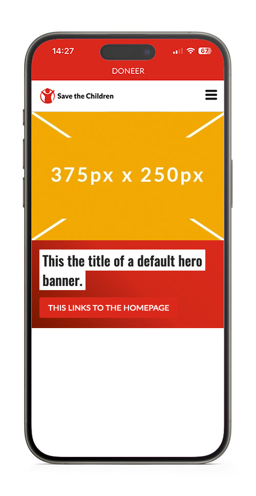
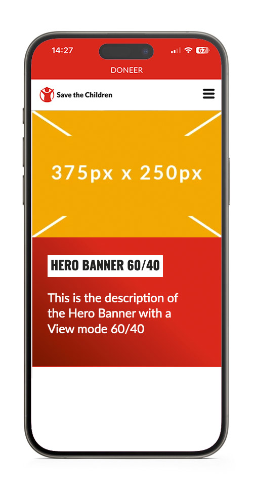
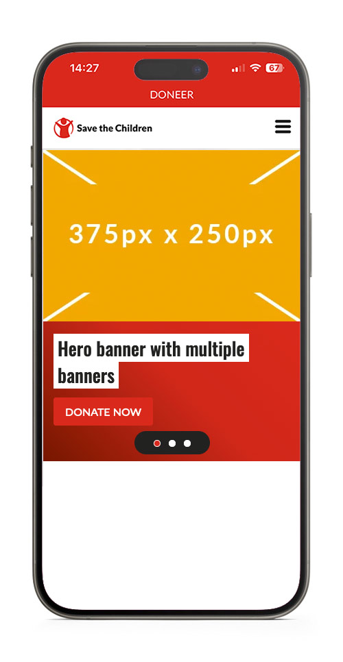
Hero Banner
Display a large hero image with text and/or a CTA on top of it. This is usually displayed at the very top of a page.
Hero with Multiple Banners
You can add multiple banners to a default (full width) hero banner.
Currently, sept 2024, the use of a carousel and a hero banner with multple banners on one page cause a conflict.
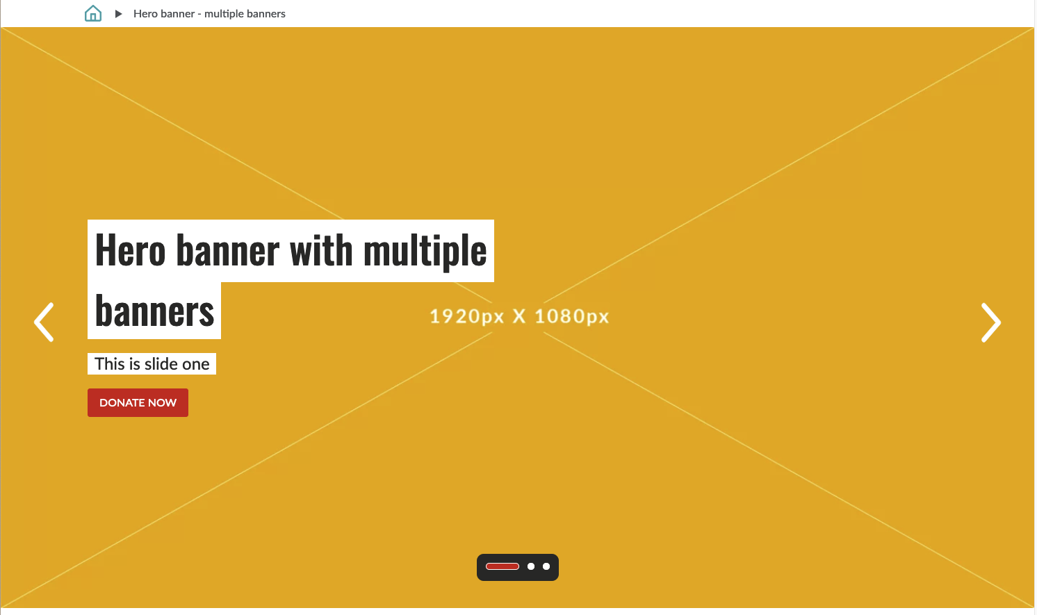
Image Sizes
The hero banner displays cropped versions of uploaded images, and scale down to the max width of the browser.
If you do not provide a mobile image, a cropped version of the desktop image will be displayed, the size is 375px x 210px.
You can control the lay-out by cropping images to these sizes before uploading the images.
| Desktop max width x height | Mobile max width | |
| Default View | 1920 x 1080 | 375px |
| 60/40 View | 1152 x 800 | 375px |
Hero Banner Mobile View